

The brief had no story. It had something better: the ingredients for one.
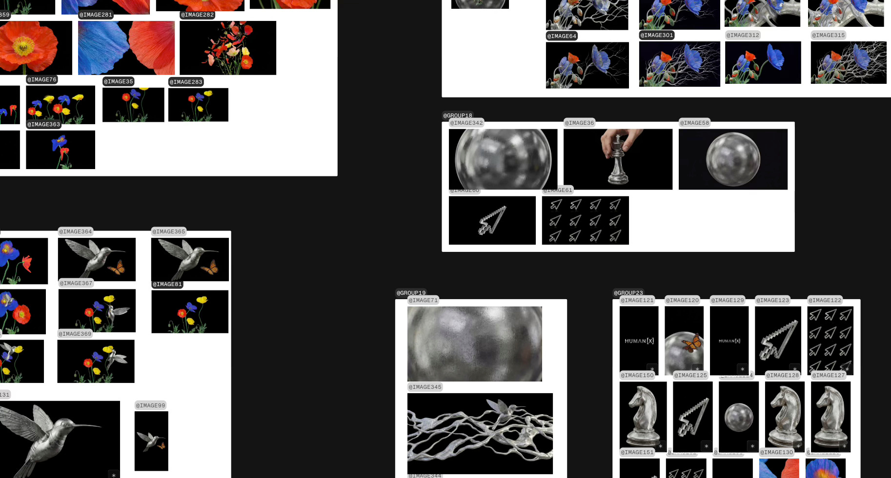
HumanX is one of the largest AI conferences in the world, from the same team behind Money20/20 and Shoptalk. San Francisco, April 2026. Theme for this edition: AI(llusions). They needed a teaser film to kick off the campaign and they came to us with a generous starting point: a fully developed brand identity. Colour palette running from deep navy to electric teal. A library of graphic elements they’d already commissioned: chrome cursors, flowers, hummingbirds, mushrooms, chess pieces, San Francisco landmarks. Video textures. Typography system. The whole kit.
What they didn’t have, and what no brand kit can give you, was the why. Why does a cursor live in the same world as a flower? Why is there a chess piece next to a mushroom? What story are these objects telling? Without that connective logic, the teaser would become what most conference teasers become: pretty elements drifting across a gradient. A screensaver with a logo at the end.
We were asked to find the story.
What we received: HumanX’s visual identity system for 2026. Strong elements, no narrative thread.
Three proposals, three worlds
We don’t present variations of the same idea. We present different films. Three concepts that share nothing except the client name. Each one a complete creative direction with its own logic, tone, and visual language. The client picks a world, not a shade.
The first one treated San Francisco as a body. Runners attacking the city’s hills. Cyclists climbing steep streets. Cable car cables pulling tight. A handheld, documentary-energy film built on the idea that innovation is physical—motion against gravity, HumanX as the summit where all that upward force converges. A24 meets Nike. No stages, no speakers, no event. Just preparation, build up, anticipation, ascent, and the city’s topography as visual rhythm. Match cuts between curves of streets, curves of cables, curves of human motion.
The second turned the city into a living museum. We mapped five iconic San Francisco artworks and proposed that they awaken, subtly, through 2.5D animation. Painterly parallax, preserved brush textures, dreamlike pacing. The premise was simple and true: before code, there were murals. Before algorithms, there were thinkers. HumanX as the next chapter in the city’s cultural scene and intellectual tradition.
Research inside MITO for the second proposal: mapping San Francisco’s iconic artworks.
The third proposal was different. Less literal, more symbolic. It didn’t look at San Francisco from the outside. It looked at the brand kit itself and asked: what if these elements already contain a story?
That was the one they chose.
Finding the story inside the elements
We spent time with the assets before touching any tool. Laid them all out on the MITO canvas. Looked at them not as graphics but as potential carriers of meaning. And a structure appeared.
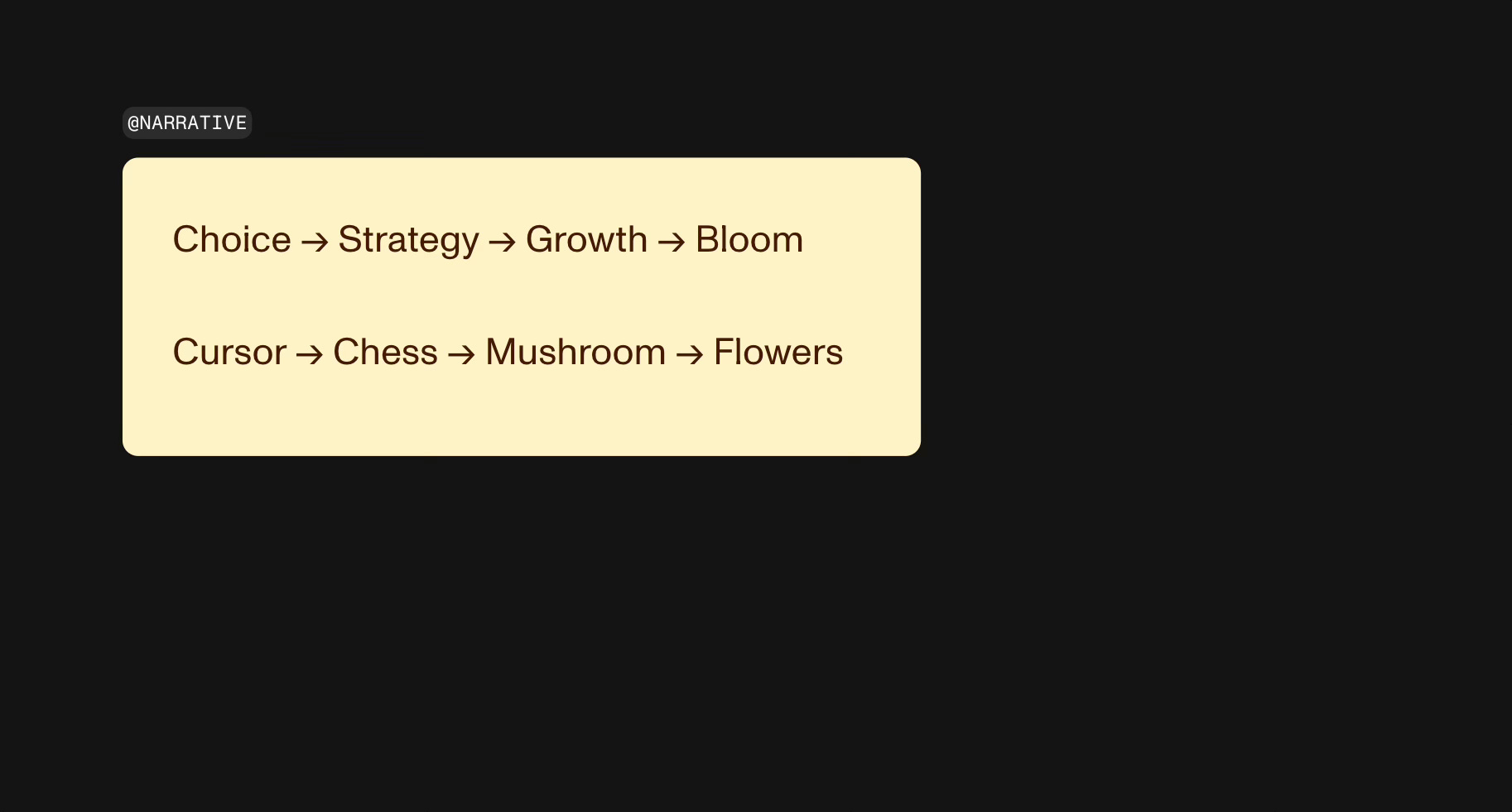
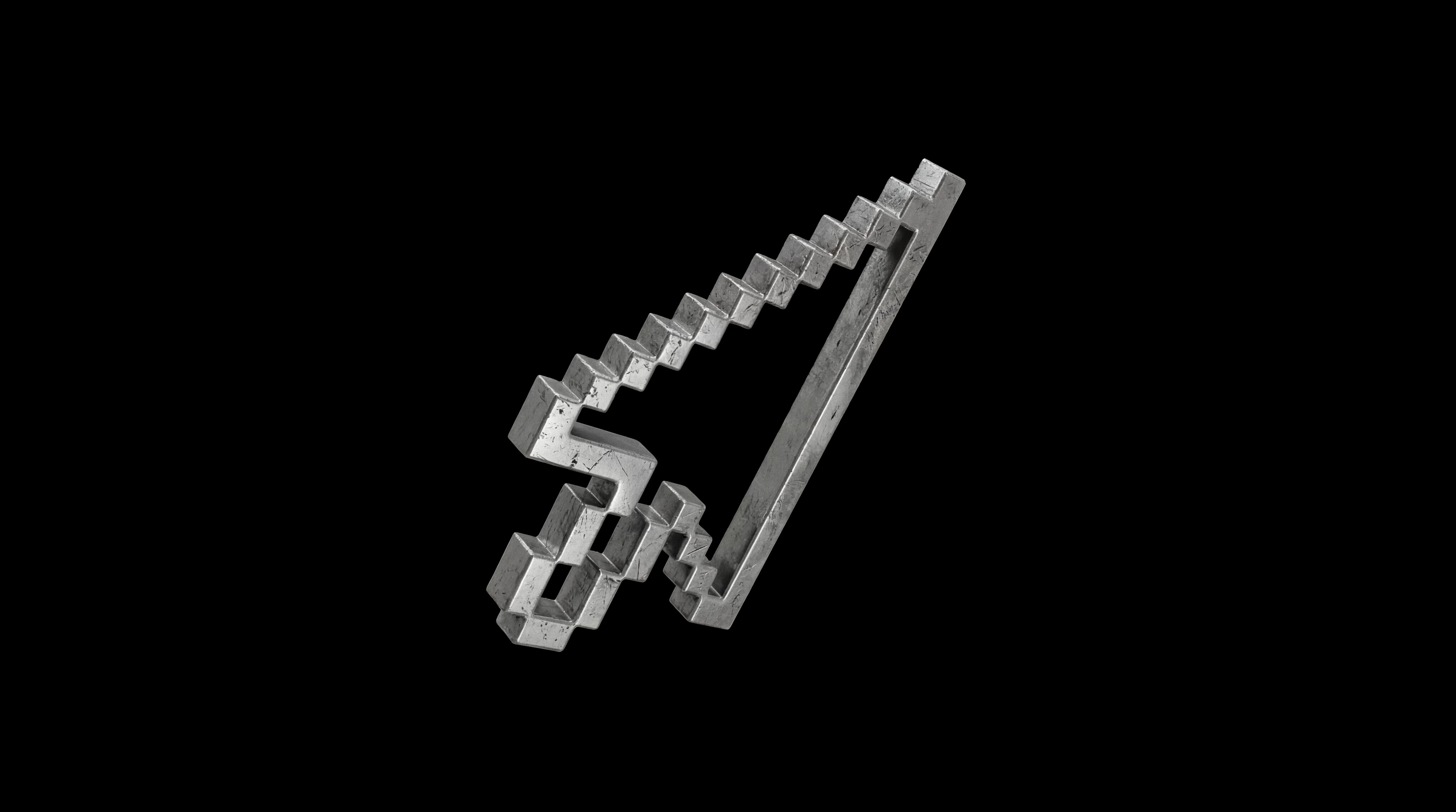
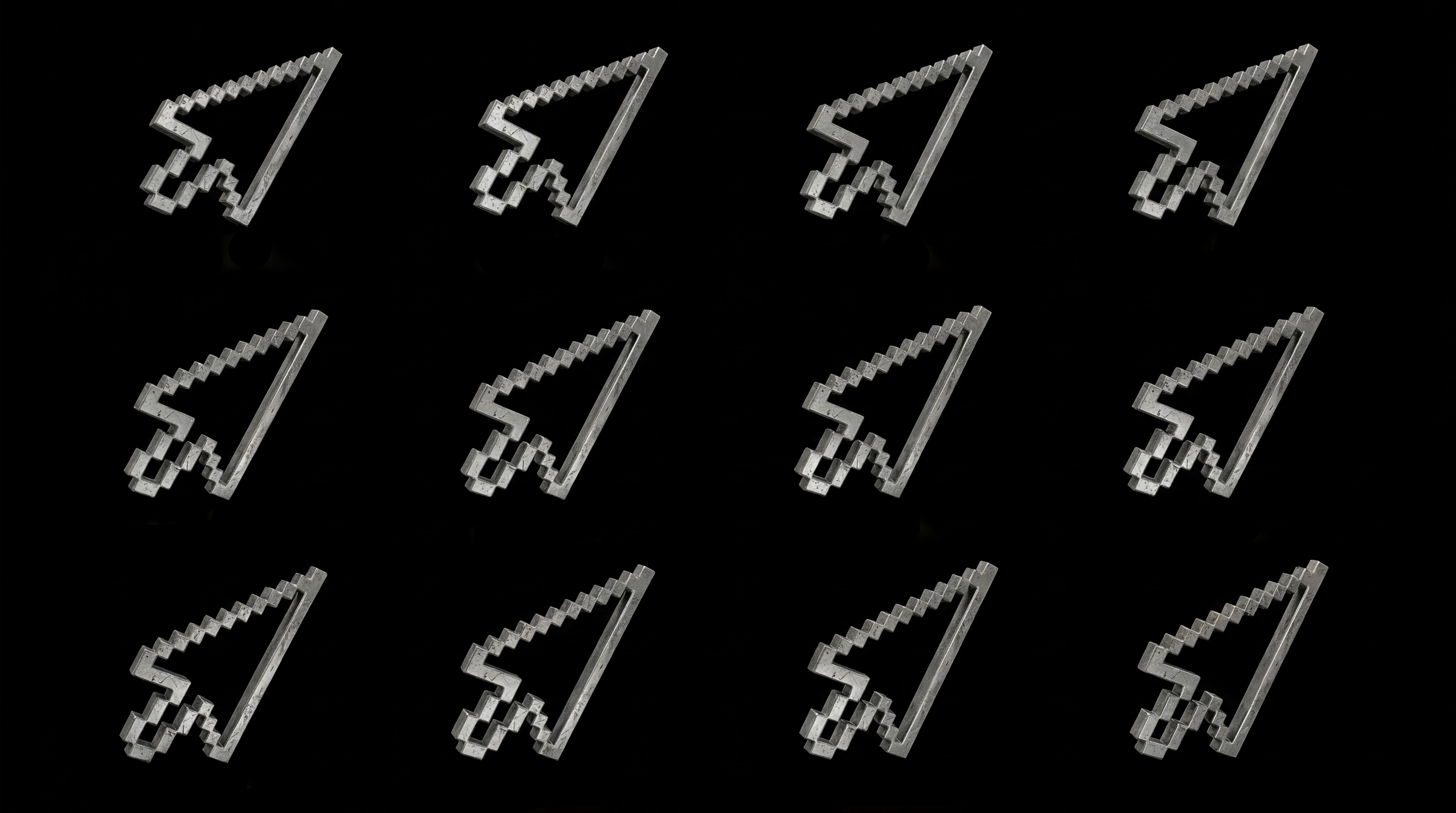
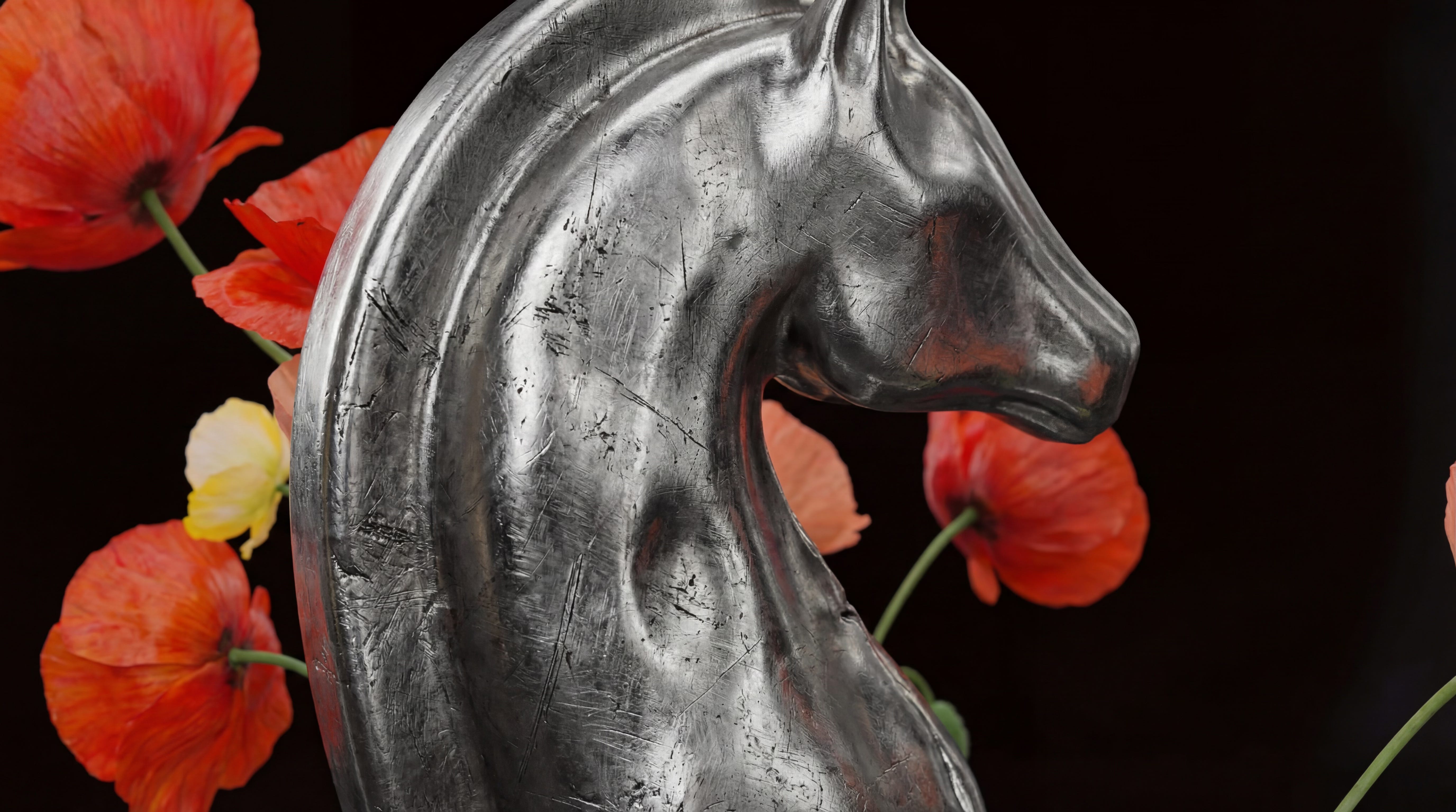
The cursor is a choice. The most basic human gesture inside a digital system. A click. The moment before everything.
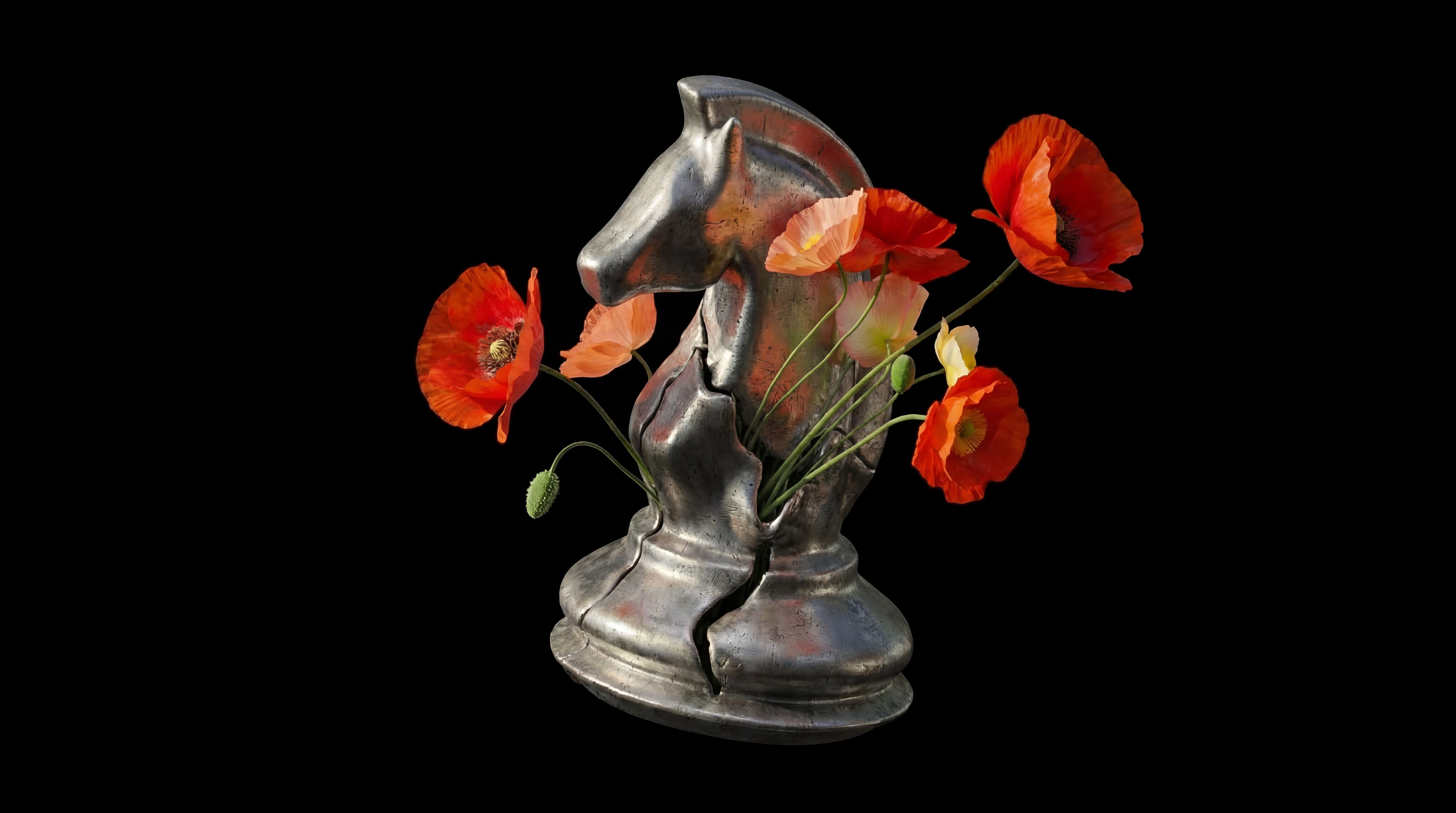
The chess piece is strategy. Not random chess—specifically the knight (non-linear thinking, the unexpected move) and the king (authority, the power centre). Intelligence operating inside rules.
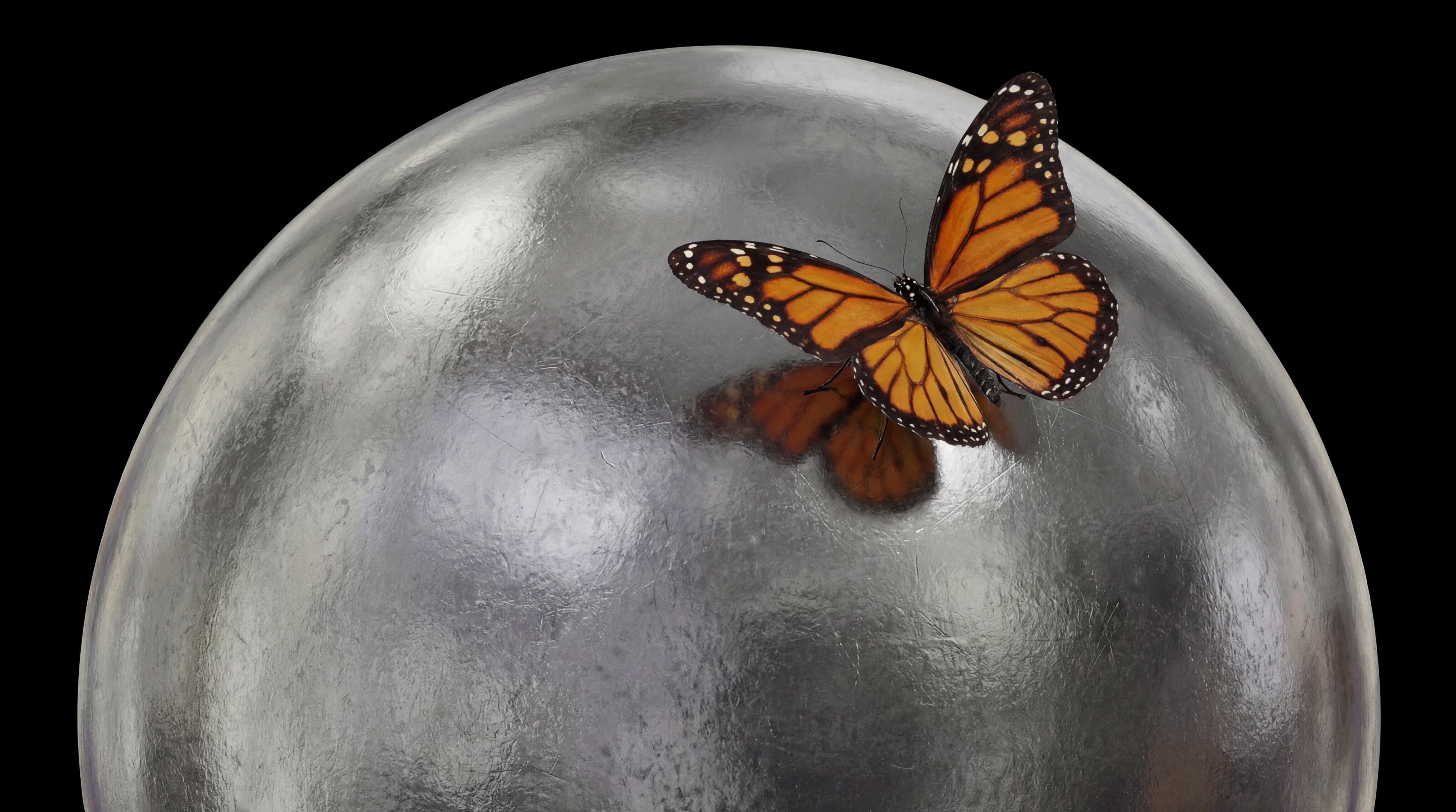
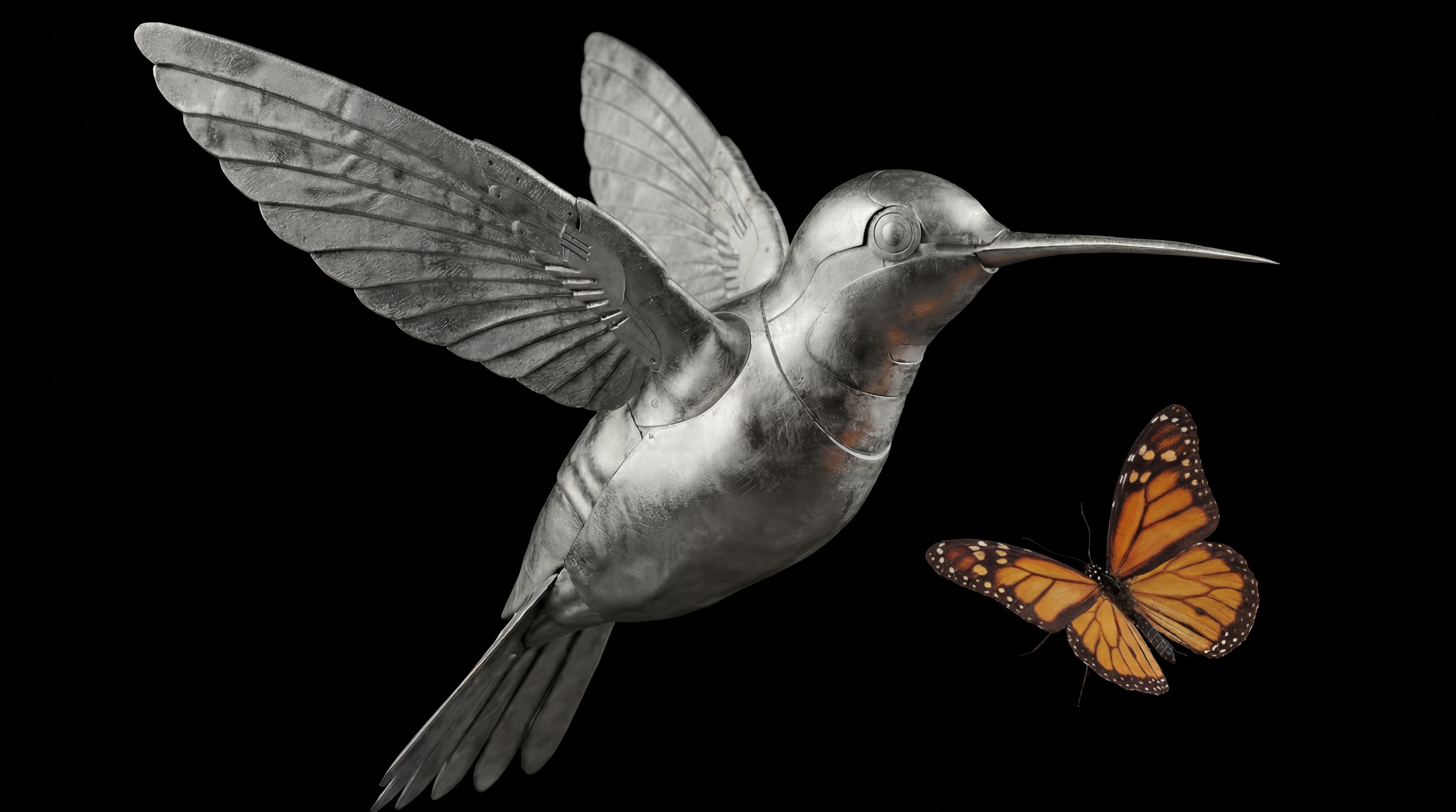
The mushroom and the hummingbird are network. Underground growth, invisible connections, intelligence that surfaces and spreads where you don’t expect it.
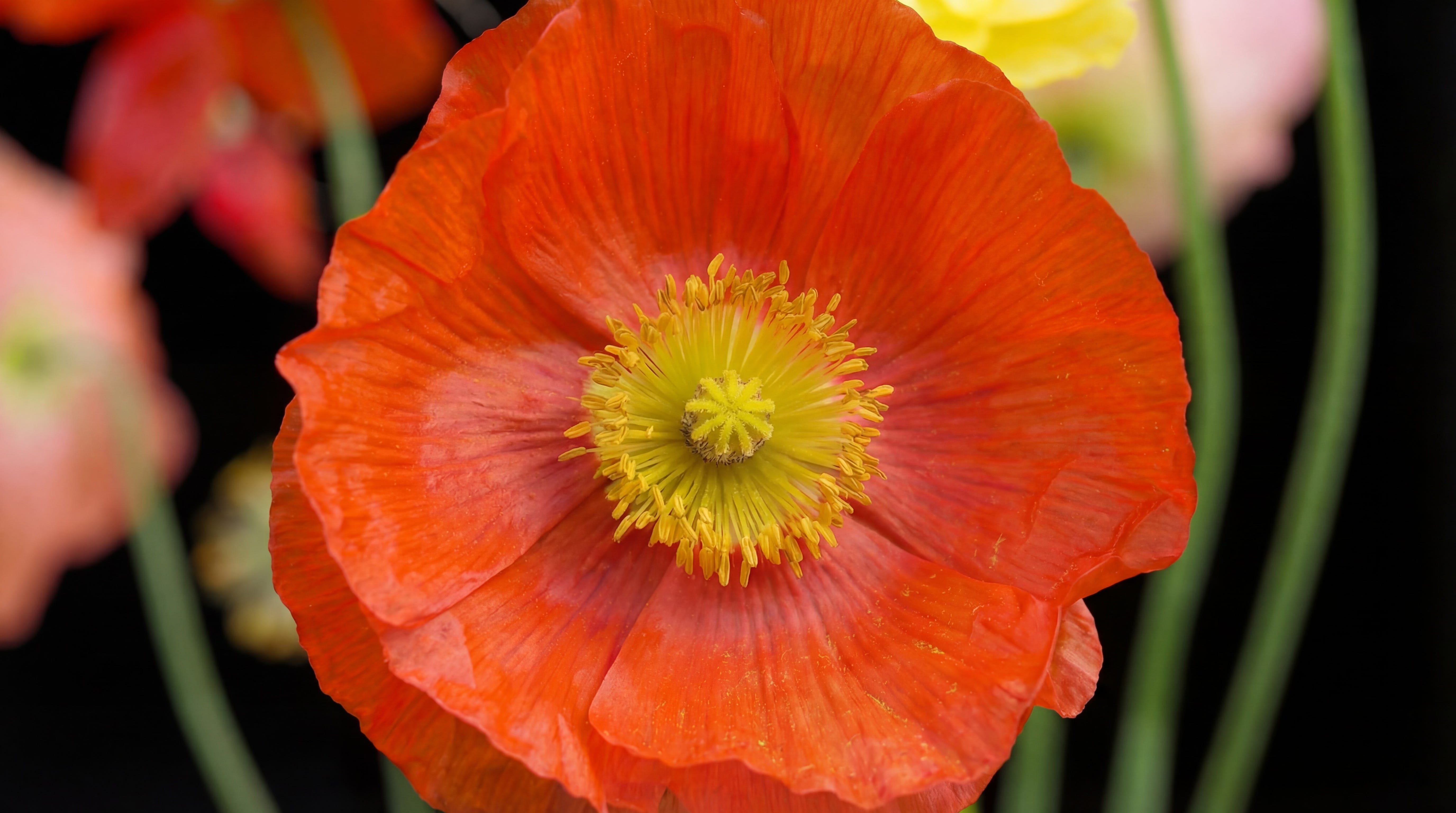
The flower is what happens next. Emergence. What blooms when strategy meets network. Emotion, colour, life. The visible result of invisible process.
Choice → Strategy → Growth → Bloom.
The story was already there. It just needed someone to read it.
That four-beat progression became the spine of the film. Not imposed from the outside—discovered inside what HumanX already had. Their own elements, in the right order, told a story about how strategic intelligence becomes emergent life. Which is, when you think about it, a pretty good way to describe what happens at a great conference.
Act I — Choice.
A chrome cursor in the dark. The click before everything.
Act II — Strategy.
Cursors multiply. The chess knight appears. Then the first flowers press against the chrome, and the text reads: “something shifts.” The organic begins to overtake the geometric.

The only human element in the film. A hand placing the king. Strategy requires a human actor.


Act III — Growth.
A monarch butterfly lands on a chrome sphere. The word: “connections.” Then the garden explodes.
Act IV — Bloom.
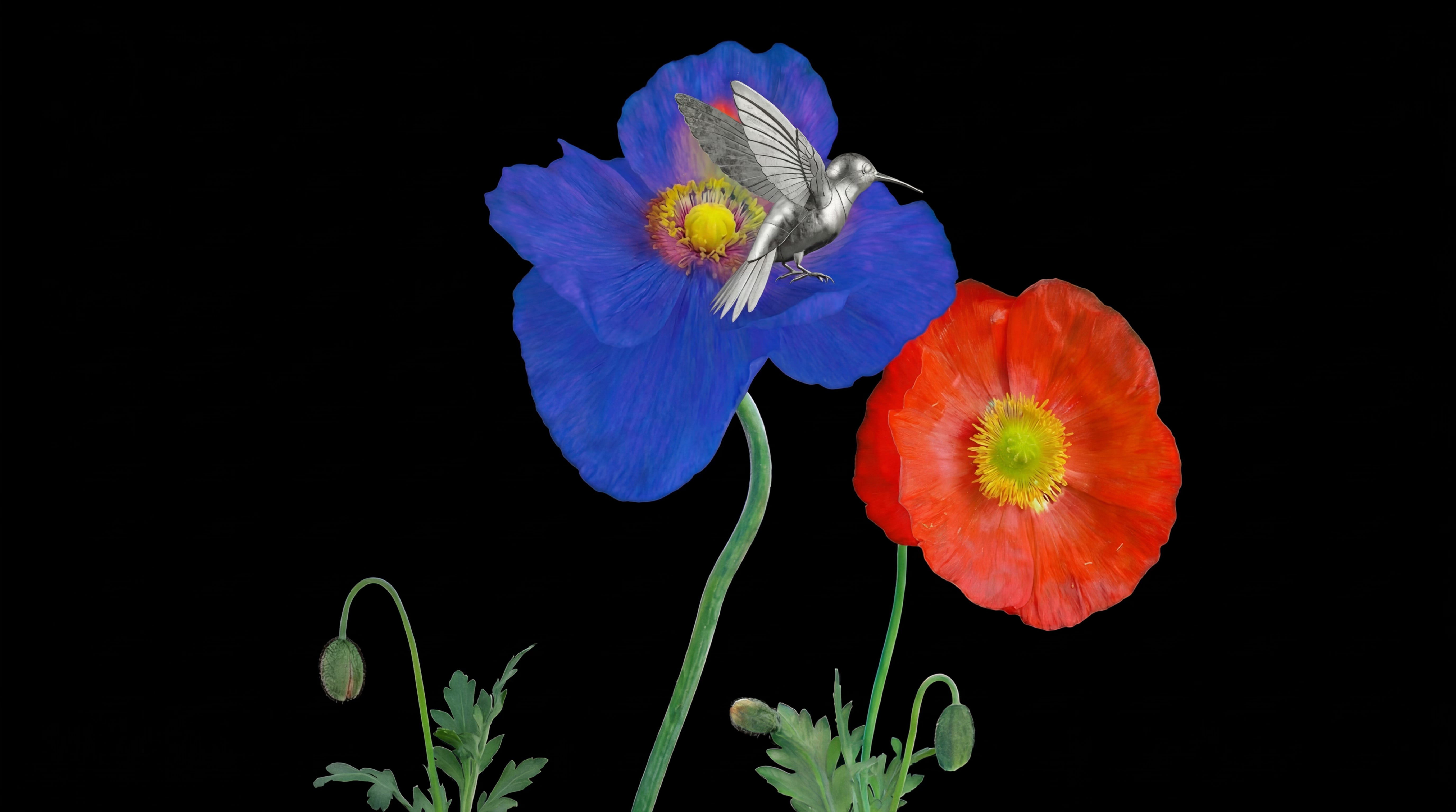
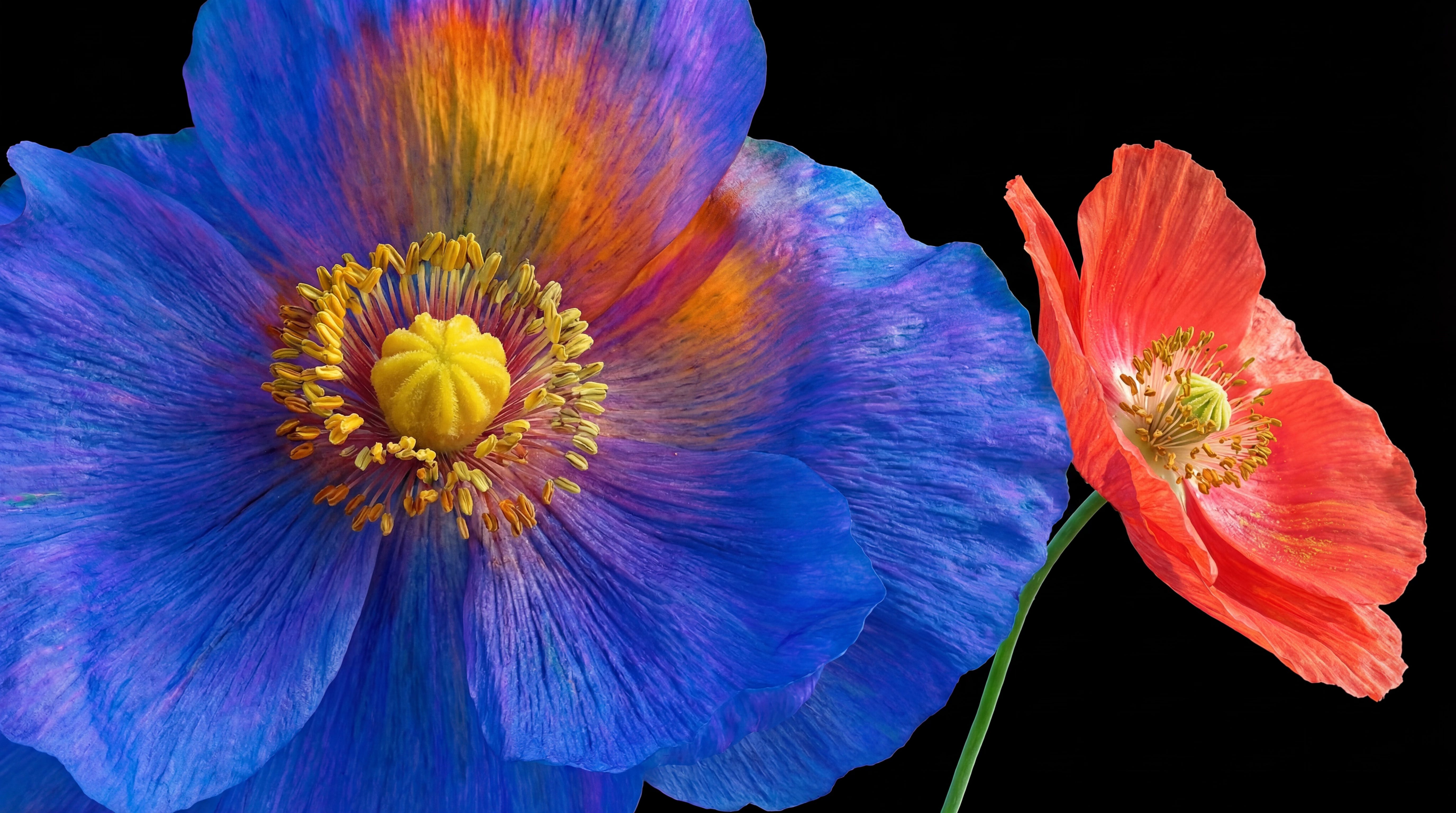
Blue poppies, chrome hummingbird. Colour consumes the frame entirely.
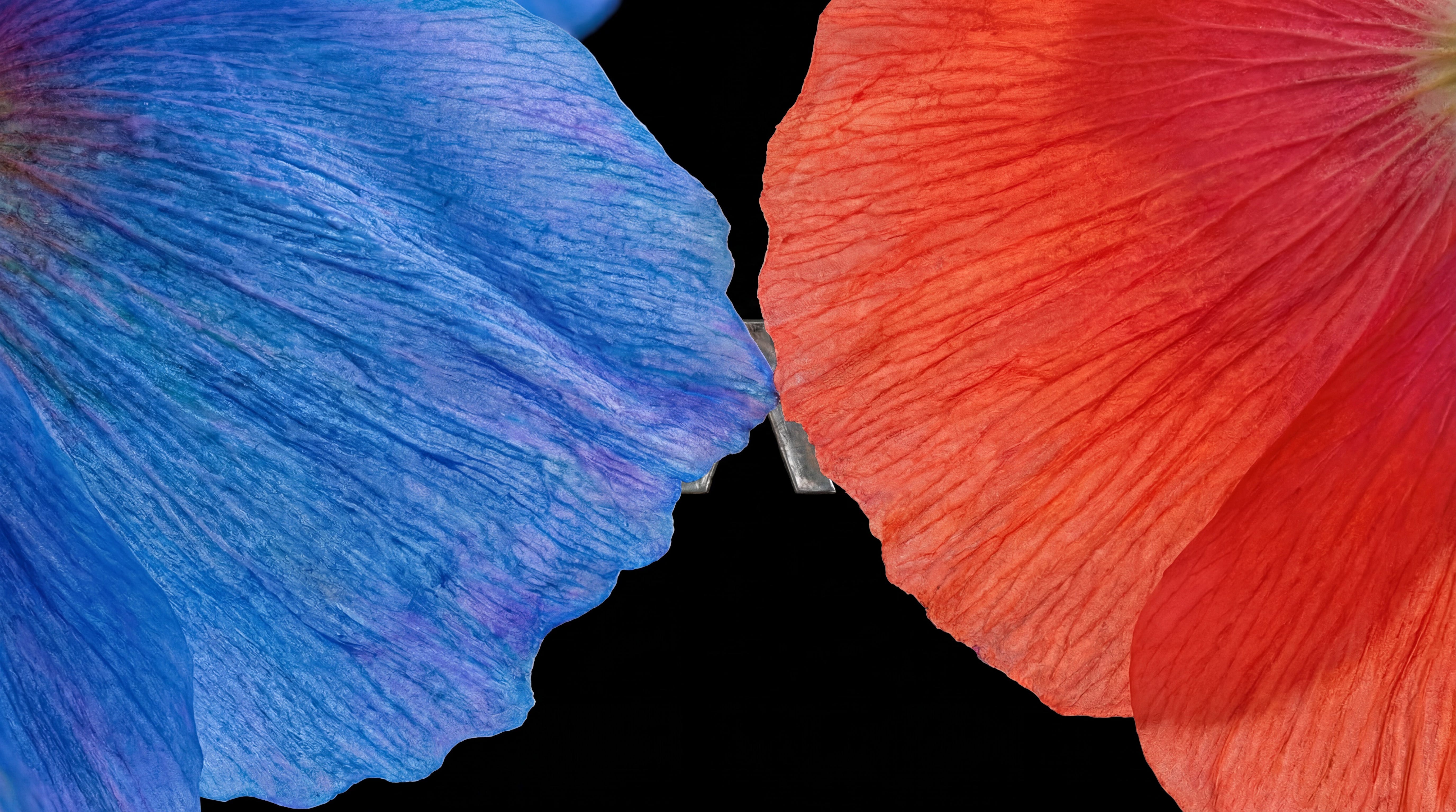
The petals converge. Then the logo arrives—rendered in the same chrome as every other structural element. Not as a graphic overlay. As an object in the world. “This is.”
How it was made
No cameras. No 3D render pipeline. Every frame was generated inside MITO using AI image and video models, but the word “generated” misses the point. Every shot was directed. Composition, light logic, material consistency, narrative progression—all held together by art direction, not by technology.
The black background wasn’t an aesthetic whim. It turns every frame into a vitrine. Objects become specimens. Your eye goes to surface, to material, to the tension between things. It also solved a practical problem: visual coherence across four very different symbolic families.
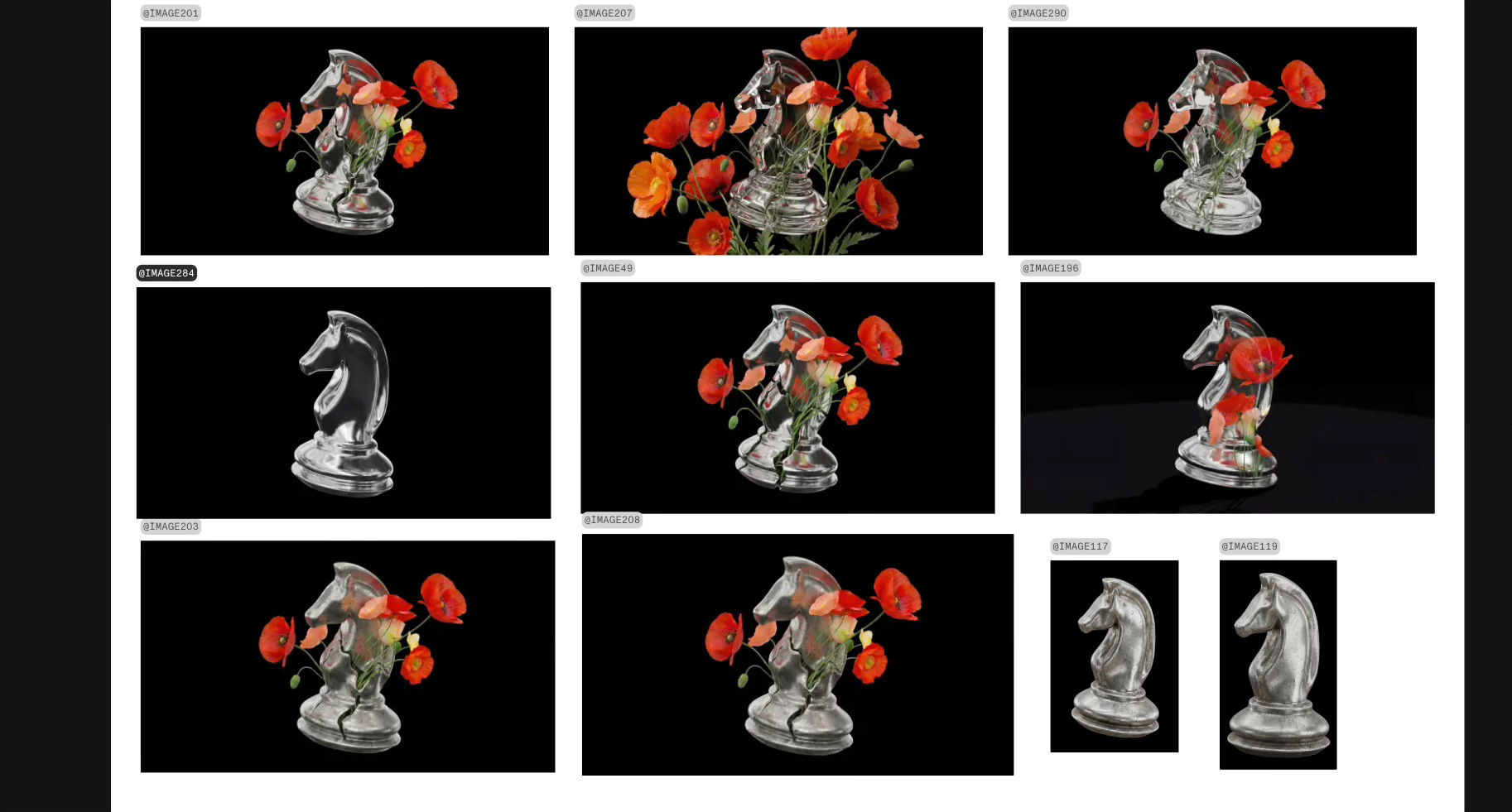
The chrome finish connects everything structural—cursor, chess pieces, hummingbird, the logo itself. Silver with patina, reflective but not pristine. It reads as both technological and ancient. Colour enters the film only through nature: first the red-orange poppies, then the full spectrum, then the blue flowers and the chrome bird together. The colour arc mirrors the narrative arc.
The text stays minimal. Single words low in frame, almost subtitles to the image: “something shifts,” “connections,” “blooms,” “this is.” The film speaks with rhythm and material, not with copy.
Sound design layered atmospheric texture with precise material presence. Chrome had weight. Petals had breath. The score built from minimal to expansive, mirroring the bloom.
29 seconds
The feedback from HumanX was immediate. They loved it. No rounds of revision, no second-guessing. The symbolic system we built from their existing elements gave them something they hadn’t expected: not just a teaser, but a narrative framework. The cursor, the chess piece, the mushroom, the flower—each element now carries meaning that can extend to stage design, printed materials, social content, environmental graphics. The brand kit became a world.
A brand kit is not a creative direction. What transforms ingredients into a world is symbolic logic—the reason each element exists in relation to the others.
When that logic is strong, the system generates outward. When it’s absent, you get motion graphics.
The blooming process applies to the work itself. First comes choice (which concept), then strategy (which symbolic system), then growth (production decisions accumulating in the dark), then the bloom—the film that feels inevitable rather than assembled.
Pretty cool!